Restricted Entry

I grew up in the ’70s.
This was a time when it seemed to be socially acceptable to be overtly homophobic, sexist, and racist. Homosexuality had only recently been decriminalised and the Sex Discrimination Act was at the ‘back of a fag packet’ stage of development. Pubs had ‘No Blacks, No Dogs, No Irish’ signs on the doors, and Bed and Breakfasts only differed in that they allowed dogs.
Mainstream comedy was awash with ‘lovable’ but flawed stereotypes. An evening viewing would be back-to-back parodies of hapless, feckless, and useless cultures cluttering up the British landscape and causing problems for the white central characters.
As I grew up, and awareness grew simultaneously, the comedic value of lazy caricatures began to jar and the masters of this trade publicly challenged. People weren’t happy. Comedy would never be funny again without the right to offend. The British sense of humour was under attack and many comics stood their ground. Their view was that satirical art form should not be restricted by political correctness gone mad. The collateral damage of a few people being offended in the face of creative freedom was perfectly acceptable.
Unfortunately, racism, sexism, and homophobia have not been banished, but this article is not about those topics, this is about accessibility.
Part of my role is to raise awareness about accessibility and educate developers on how to avoid making websites and applications inaccessible.
Most people I speak to are completely unaware of accessibility, what it means, and who it affects. They quietly confide in me that they had never heard of it.
Many are not educated about accessibility, how it works, and the impact of getting it wrong. They gasp and shake their heads as I explain about alternative text, navigation, and labels, and the user experience when these are done badly.
But in almost all of the conversations I have had with people, they leave with an understanding of what it means, who it affects, and what they may need to do.
However, in a recent conversation with a group of UX designers, I was challenged by one of them. Her design, the colours, and the alt text behind the images failed Web Content Accessibility Guidelines guidelines. This failure was not a box-ticking exercise, it meant that fundamentally this part of the product was inaccessible. Her view was that her creative freedom should not be curtailed by a bunch of rules that, until now, she had never heard of.
This rabid self-justification provoked a creeping sense of déjà vu in me, and brought with it an ill-defined unease. I explained to her that my role was not to police, it was merely to raise awareness and attempt to educate. The third stage, intent, was down to others.
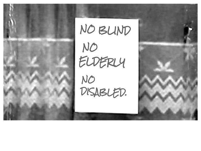
But I did think that if you know what accessibility means, and you know what you need to do to make your products and services accessible, and then you choose not to, you might as well have ‘No Blind, No Elderly, No Disabled’ sign on your home page.
Kate Morris is an Accessibility Champion for Deloitte
Digital Accessibility is the ability of a website, mobile application or electronic document to be easily navigated and understood by a wide range of users, including those users who have visual, auditory, motor or cognitive disabilities.
Inclusive Design is a design process in which a product, service or environment is optimized for a specific user with specific needs.
Inclusive Design and Accessibility seek to harness design practices and assistive technology to ensure that no one is excluded because of their disability.
